Blog Summary

Dan Seng's journal of his travels as the 2011 University of Illinois Francis J. Plym Travelling Fellow

Wednesday, September 28, 2011

HELSINKI PART III

This title is more than just a tally of the number of Helsinki postings on this page. It's what's just arrived and is on the way for Helsinki. It's like Rocky III where the champ has been knocked down by his opponent and he's looking for that "Eye of the Tiger" competitive edge. Only in this series, Helsinki's opponent is not the powerful Russian (that was Rocky IV) or even Clubber Lang (it's hard to imagine Sweden as Mr. T). This time the competition is global and harbors all over the world are competing for the shipping business that drives growth in their city. 
Public access to the waterfront plays as much a part in the Helsinki waterfront planning as does the need for a cutting edge shipping terminal. I'm seeing a clear pattern across the European continent of shipping terminals turning over to mixed use waterfront developments as drivers of economic change. Helsinki has taken the opportunity with two harbors, Kalasatama and Jätkäsaari, to bring the city to the water. With the Jätkäsaari development, Helsinki seeks to build a thriving new business and residential area that produces zero carbon. 
Inland, too, Helsinki is making solid planning decisions that build its cultural capital. The Planning and construction in and around the Finnish Parliament building covers a period of nearly 80 years. The area includes a new Music Center by the Finnish firm LPR and Kiasma, the museum of contemporary art designed by Stephen Holl. From what I can gather, the concept for a public park between them did not exist until recent years. It was part of neither Saarinen's nor Ehrenstrom's master plans. It opened to the public this summer and certain areas are still under construction. 
view of Park from top of the Parliament Building steps.
Parliament building from Kiasma
The designers (if you know who they are please chime in) had fun exploring the concept of the “square” in three dimensions. To take advantage of an existing grade separation, the square terraces down from the music center to meet Kasari. At the base of the terrace a new tunnel beneath Mannerheiminti will allow pedestrians to flow from the train station to museums, the church in the rock and Finlandia Music Hall without crossing this major thoroughfare. It's a smart bit of planning that expands the possibilities for this area as a cultural center for Helsinki. Here you will find a good article about planning underway throughout the city.


Helsinki's waterfront is an organism that grows, moves and changes over time. This overlay shows how the shoreline profile has changed in the last century. Plans for Kalasatama and Jätkäsaari are the latest in a long series of changes to this vibrant connection to the sea.
Map showing shoreline in 1902 with overlay of current shoreline (source)
I can see Burgess Meredith urging on the City of Helsinki with these words: "The population of the Helsinki region will grow from 1,3 million to 2 million within the next 50 years. The amount of required new building is so great that it enables developing the region's overall structure in a way which strengthens the region's position and competitiveness as one of the Baltic Sea region's leading cultural and technological centers and an appealing residential and business location." YOU CAN DO IT ROCK! 
The words are actually from the City Planning site (except that last part). In 2006-2007 the City of Helsinki launched the master planning competition Greater Helsinki Vision 2050 seeking assistance in preparing for the anticipated population growth. From the 86 entries they selected WSP Finland's entry "Emerald". Their master plan formed the basis for the planning at Kalasatama and Jätkäsaari.

Kalasatama

Work has started to add 15,000 new residences and 8,000 new offices in the abandoned shipping and fishing harbor in Kalasatama (Fish Harbor.)
The existing Helsinki Energy power plant is located on the harbor peninsula directly west of Kalasatama. It will continue to produce power from the 6-story high mound of coal on site and will provide the power for the new development. Since recently completing a comprehensive network of tunnels and pipe distribution for a regional district heating system they have a new revenue source and can boast one of the highest efficiency ratings possible for this type of plant. Helsinki Energy has also announced that they - working with Nokia, Siemens and others - will provide a smart grid on the site. What this actually means remains to be seen. Technology will further boost power efficiency but it has less impact on CO2. The carbon emissions for the site are not world class.


The same can be side for the design caliber of the proposed buildings. The City of Helsinki Planning department is structured to provide master planning for all new city development areas. Unfortunately, and apparently because of this, innovative building designs and integrated design thinking is lacking from the plan for this area. The metro system already serves the area and bus route revisions are in the works. The vacuum tube waste collection company, Envac, has recently announced that their system was selected for the site, which helps the site’s overall carbon emissions. So, sustainability is a part of the discussion, but not the primary driving factor for the development. The site’s access to waterfront and the city coupled with the fact that views of central Helsinki from the harbor are spectacular, will help overcome the design and sustainable shortcomings and make the development a success.

Existing gas works buildings on the western part of the site are leased out to artists, musicians and architects. These bold first occupants of the harbor provide a test bed for the connectivity and functionality of the site as a viable commercial area. One question resonates with projects of this magnitude and timeline: what do you do with the site until the project’s scheduled completion in 2030? The city, on this point, has hit on a winning idea.
Arriving at the site (which is convenient due to the public transportation connections) both signage and painted path lines on the pavement direct visitors and indicate your distance to the waterfront. The path makes a 2.5 Km loop around the ongoing construction activities. Along the path you have both views to the city over the water and an 8 ft high, kilometer long, colorful mural of publicly supported graffiti.
The wall encloses staged construction material and debris. The likelihood that this wall would be a target for such activities must have spurred on the idea that the city should turn it into a public amenity. By furnishing the site with appropriate waste and storage containers while encouraging independently scheduled and funded summer activities, Helsinki made public access to the water possible well ahead of scheduled construction completion. Aritists (of the graffiti variety for one), musicians, DJ's and random event planners rent the containers to store their wares between shows. The one condition of the use of the site and containers was that events had to be open to everyone. The frequency of events and attendance numbers this summer, with help from social media, brought about public awareness to the site's development while opening up a new public playground.


Jätkäsaari
In 2008 The City of Helsinki and Sitra (the Finnish Innovation Fund) combined forces to address the city planning challenges ahead of them. As part of the solution, they jointly hosted an international design competition called 'Low2No' to seek innovative zero carbon solutions for one block of the Jätkäsaari harbor development. Formerly a shipping port, the shipping companies and their containers have all moved to Vuossari harbor east of Helsinki. The 100 acre site will include housing for 16,000 new residents and offices for 6,000 new jobs and construction will be finished by 2024. Plans include tram connections, ferry and cruise terminal ports, public waterfront access, a library, school, day care center, community center and a church. For the development of the Jätkäsaari harbor, Helsinki is raising the stakes on carbon emissions, design and sustainability
The winning entry by the team of Sauerbruch Hutton, Arup and Experientia based their strategy on a holistic view of the development that encompasses not just the buildings, climate, transportation and utilities, but also the team, the users and the life-cycle use of its buildings. 
Using the inherent energies of a community and extracting it from the waste of one component and converting it to the energy needed by another. The project team is currently developing the design. Further information about the process can be found on the low2no blog. 


While I was in Helsinki, Sitra had a release party for their book "Recipes for Systemic Change". The book is available in PDF form from the Helsinki Design Lab web site. Inside, there is a case study with detailed analysis of the challenges Finland is facing in reaching carbon neutrality. The information has relevance beyond the nation's borders and is full of interesting data.


If these two developments can stay on schedule, they will keep Helsinki in the international fighting ring. 


Monday, September 26, 2011

HELSINKI - SAARINEN AND AALTO


VR advertising campaign
Central Station 

The Finland national rail service company 'VR' has launched a big ad campaign centered on updates to their trains and web services. Serving as the mascot and spokes person is a computer generated parody of the stone statues in front of Helsinki's Central Station. Eliel Saarinen designed Central Station in 1909. These statues were a symbol for the enduring strength of an industrialized nation. Now they are buffed out actors wearing caps and aprons touting carbon friendly tourism and hassle free ticket purchases. Wouldn't Eliel be proud?
HELSINKI CENTRAL STATION
Saarinen’s plan for the station contributed a new public square to the downtown area, the Rautatientori. The growing relevance of the train coupled with the socialist agenda of the early 20th century, shifted the geographic (and political) city center toward the railway station. Even today, the train station serves as the heart of the city with the shopping and government buildings along the esplanadi as the left arm and the cultural institutions and offices along Mannerheiminti Blvd as the right arm.
FINLANDIA HALL AND STORA ENSO
Finlandia Hall (on Mannerheiminti in the west) and the head offices for ENSO (on Market Square in the east) - Aalto had significant commissions on both sectors of the city.
It’s rumored that Aalto explored the concept of placing a building on this site as a 1923 competition entry for the parliament building, 35 years before he designed ENSO's offices. His entry was a runner up. You will see more about the selected parliament building in my next post. If the entry was in fact Aalto's then he understood quite well that the prominent site is wrought with complex parameters. It stands at the terminus of the esplanade across a wide port area, Market Square. It stands at the foot of the Orthodox catholic cathedral and is a stone’s throw from Engel's Senate square. The design is definitively modern with historical references to the adjacent renaissance style buildings. Five stories clad in white carrera marble sits on a base level clad in granite. The building's top floor steps back from the main facade completing the oeuvre to Italian palazzo style (piano rustica, piano nobile, corona aedifici). 
He worked with a rigidly spaced glazing module. It’s height provides clear views of the cathedral from the Esplanade and the port plaza. Despite this being a private contract, the building design respectfully addressed the surrounding civic style and sight lines. The result is an office building designed with the prominence, materiality and appearance of a civic institution. The clients at Enso remain in the building to this day. They may have understood how this public perception could be a helpful bit of marketing. In the words of their own 1992 brochure about the building, "[the building] is a symbol of the Finnish wood processing industry, which ... reflects the lasting values of neo-classicism hand in hand with a modern belief and optimism in the future."
Turku Cathedral- tower 
OTANIEMI TECHNICAL UNIVERSITY 
Because so much of Helsinki was designed after the start of the 19th century, you have to explore other cities to trace the roots of Finnish architecture. Copper roofs and red brick are now an intrinsic part of Helsinki. The earliest cathedrals in Turku and Porvoo are built in red brick and crowned in copper. As the Tsars intended, those 150 years of Russian rule and design under the influence of the Italian Renaissance left Helsinki looking more continental European than Scandinavian. 
Though you can’t credit Aalto alone for this, his re-introduction of red brick and copper back into the vernacular of 20th century architecture had a significant role in a revival of its use by architects who replicated his style and philosophy. The proportion, style and materiality of the Otaniemi Technical University buildings are evident in buildings throughout Helsinki and surrounding areas from designs of his followers. 
The two soaring lecture halls are the core of the central student building and the campus. After 65 years the buildings have a warm and enduring appearance. Spaces are bright with natural daylight and the setting is uniquely Scandinavian. Skylights and custom designed fixtures harness and bounce light. The studios for the school of architecture below is an example. 
Wood or a custom bronze casting is used on handrails, doors and wall cladding, and they are organic forms that are smooth to the touch. Floors are dark and durable and look as good today as as a new floor.
AALTO'S STUDIO
There’s something to be said for providing a healthy environment for exploring concepts and executing the details. The studio where Aalto designed these projects shared a connection with nature and day light that you find in his buildings. 


A temporary exhibit of the relationship with metal worker Viljo Hirvonen shows a  process of exploration and creativity where two men shared understanding to design a beautiful thing. You can also see the fruits of this type of relationship with wood workers in the fluid designs of the laminated wood furniture.
ACADEMIC BOOK STORE
One Aalto project that nearly every American will recognize because it has been blatantly plagiarized by Barnes and Noble is the University Bookstore. A brilliant central atrium is daylit by sculptural clear glass skylights. Giant wood framed operable windows ring the perimeter of the store (though these are largely closed off by shelves today). 
“Café Aalto” and the entry lobby both prominently feature custom light fixtures, brass railings and door pulls.

Sunday, September 25, 2011

EARLY PLANNING OF HELSINKI

Ehrenstrom's Master Plan drawing of 1812
Walking through the streets of Helsinki, there is a certain freshness to the renaissance revival buildings that you don't find elsewhere in Europe. Once learning a shred of the nation's history I found an explanation.  Between the 12th and 17th century, the area now known as Finland was part of the kingdom of Sweden. Until the 19th century Turku, 170 km west of Helsinki, was the capital of Finland. In 1809, Russia defeated Sweden in the Finnish War and made Finland a Russian autonomous state and it remained as such until 1917 when Finland withdrew from Russian rule declaring its independence.
It was during the Russian rule that Helsinki took on the appearance it has today. To further remove Finland from Swedish influence, the Russian Tsar moved the capital and the University from Turku to Helsinki. Most major European cities developed as a city as far back as their medieval charters. Helsinki developed primarily within the last two centuries.
Kallio Church
In 1812 Tsar Alexander appointed military engineer Johan Albrecht Ehrenstrom as head of Helsinki's reconstruction. Ehrenstrom planned the city with a senate square at the center with axial streets ordering the street grid. The hilltop church (Kallio) to the north and Tahtitorninmaki park to the south form the termini of the north-south axis.
Esplanadi looking east to the port
The location of the port, the east-west running esplanadi and the main thoroughfare Manihamintie cutting diagonally across the grid were components of his original master plan.
Cathedral, University building and Library (behind the steps)
This plaza is the city's prime public gathering space for rallies and celebrations.
In 1814 Shortly after his appointment, Ehrenstrom hired the German architect C.L. Engels to be his lead architect. For the next 40 years he was the city architect. His most notable contribution is his design for Helsinki's Senate square, which includes the Helsinki Lutheran Cathedral, the University Library and the Senate Building. Ehrenstrom's plan and Engels building designs established Helsinki as a European center. They set the order and organization for the city that Eliel Saarinen and later Alvar Aalto would build upon.


Monday, September 19, 2011

DORDRECHT AND ROTTERDAM, THE NETHERLANDS

DORDRECHT
This city 100 km southwest of Amsterdam was close enough to visit on a day trip by train. Together with Zwijndrecht, the city across the river, the population of the area is 190,000 people. It's location at the confluence of three major rivers made it a trading center that connected the finacial centers of Rotterdam and Den Hague to the north with delta cities of Breda and Antwerp to the south. Historic Dordrecht is a network of narrow roads bridging canals that meander between medieval buildings.


The town's 13th century der Grote Kerk or "the big church" is visible from the water at the western harbor to welcome sailors home (or to remind them that god was watching them). The play between old and new in this town is delicate but not reverent or conservative. At the center of old town is a town plaza surrounded by modern shopping.

The Dordrecht Museum by Dirk Jan Postel is a crafty juxtaposition of glass and metal amidst the brick and wood of the neighboring buildings.
I ventured outside the second canal to see the token Dutch windmill that dates back to 1713 and stands between a 1990's apartment building and a turn of the century (20th) row house building.
The 1939 Theater Cafe addition by Sybold to an 18th century neo-classical J. Verheul building shows that Dordrecht appreciates both new and old.


Today, planners have put in motion a scheme to develop the waterfront area west of the Hugo do Grootlaan bridge. This area is called Maasteras. It will comprise 80 acres on the north and south side of the Oude Maas river. It stands as a gateway to the two cities with proximity to historic Dordrecht and access from major roadways and the central train station.The north will be predominantly educational buildings for the Zwijndrecht and Dordrecht Colleges and office buildings. The south is planned as housing, offices and green space. Divided by an on ramp for the motor way, tunnel access for a second motor way and the base of the bridge itself, the southern site will pose some complex challenges for designers not least of which is the reroute of transport for hazardous cargo currently running through this zone.

ROTTERDAM
Image from OMA
After 10 years in the drawer, the city of Rotterdam dusted off OMA's drawings for the 160,000 m2 De Rotterdam complex and started construction last year on Wilhelminapier. Now rising several floors out of the ground, the mass required to pull off the city within a building concept is obvious. Piano's design for the KPN Telecom building in 2000 was a creative counterbalance to Carlatrava's Erasmus bridge. The two structures stand adjacent to one another in mutual admiration of their structural prowess. The new complex tends to make the slender column supporting the canted facade of KPN look more like the legendary dutch boy Hans Brinker with his finger in the dyke.

 The day for visiting Rotterdam couldn't have been better. The sun was shining and warm, it was the annual World Port Days and Wilhelminapier was the epicenter of all the action. Plans for this abandoned port have been in the works for more than a decade.
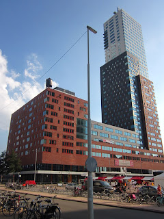
 Montevideo
Esplanade at New Orleans
The New Orleans tower opened recently and at 160.5m is just 4.5m shy of the Maas Tower down the street, now the tallest building in the Netherlands. Five more buildings named after American cities are designed, ready for construction when the economic tides start to shift once more.
If you are in Rotterdam, visit the NAI (Netherlands Architecture Institute.) They have a top notch architecture book store, rotating and permanent art and architecture exhibits and self-guided tours of the Sonneveld house across the street. This is the best part as the Broek and Van der Vlught designed building is immaculately restored, including replicas of Van der Vlugts furniture designs.

AMSTERDAM, THE NETHERLANDS


If you’ve paid any attention to architecture rags, blogs or lectures in the past decade it has been hard to miss the eye popping projects coming out of the Netherlands. Rem Koolhaas’ OMA helped pave the way for the next generation of designers by demonstrating that nothing attracts a tourist quite like a sleek new building designed by the hottest new architect. The reality is that the building boom of the last 15 years has enriched Amsterdam’s image and carried on a tradition of fostering great design and not shying away from taking chances.
HISTORY 
Het Schip (the Ship) is DeKlerk’s master work. It is located in a cluster of his other residential buildings in the Westerpark area northwest of the city center. Taking cues from his western counterparts Wright and Macintosh, DeKlerk designed everything in this building from the door knobs to the type face on the graphics. He gave birth to the Amsterdam school and raised it on a hardy diet of socialism. He designed for the working man and put him on equal standing with his employer. Het Schip was designed with a post office at the northwest end. It was unusual at the time for a post office to be located in a working class neighborhood since it was common for workers to neither read nor write. It included a banking service for cashing and depositing checks. DeKlerk’s aim was to put an end to the cycle of working 14 hrs/day for seven days a week, then drinking away the earnings on pay day. The post office is now a museum where well-informed docents provide scheduled guided tours.
The residential red brick buildings with organic expressive forms and simple ornament throughout the city speak to DeKlerk’s influence. The school was built on principles of redefining architectural style and righting social injustices. This later gave rise to replication of the style. 
Sonnerveld House, Brinkman / van der Vlugt - Rotterdam, NL
Rotterdam Van Nelle Factory, Brinkman / van der Vlugt - Photo by F. Eveleens
Under the influence of the Bauhaus movement, architects such as Jan Duiker, Berlage, Rietveld Johannes Brinkman and JA van der Vlugt lead a functionalist movement exploring extensive use of steel and glass, the most notable of which were Duiker’s Sanatorium in Zonnestral and Brinkman / van der Vlugt’s Van Nelle factory in Rotterdam. 

Much of The Sanatorium was recently beautifully restored. Portions of the interior remain unfinished. After touring the interior, Duiker’s mastery of the trade in his short career is clear.  

Willem Dudok was a prolific and largely self-styled Dutch architect. Between 1920 and the early 1970’s he borrowed stylistic moves from the Amsterdam school, the functionalist and Viennese secessionist movement and even elements of Frank Lloyd Wright’s prairie style. 
Following principles espoused by LeCorbusier’s manifesto, starting in the early 1960’s  Aldo VanEyck and then Herman Hertzberger built the structuralist movement exploring a more humane urbanism and structures of concrete and steel with distinctive  humanist elements. 
The open stairwell of Hertzberger's Willemspark Montessori School serves as a gathering space for the surrounding classrooms. The design takes advantage of every corner of this multi-level facility with storage containers, desks, seating or shelves. The design was flexible and adaptable to the needs of the future. In the late 1980’s Rem Koolhaas and his contemporaries brought a design under deconstructivist influence that remains visible in in the designs of today's architects.

The Music House and Hotel Movenpick
ZEEBURG - The Eastern Docklands includes the following areas: 
·         Oostelijke Handels kade
·         Java Island/KNSM Werf
·         Borneo-Sporenburg
After the shipping industry transitioned from mixed cargo to container shipments in the 1960’s ships grew and trains replaced ships for personal travel. Shipping companies moved their terminals west of the city and the east docklands were largely abandoned in the 70’s. These docklands east of the Central station were an opportunity for the City of Amsterdam to keep businesses and higher income families in the city. The City implemented programs to promote well-designed, mixed-use, socially mixed, sustainable buildings. This program broke a pattern of urban infill with low-income residential buildings. The result brought more revenue to the city, provided more livable communities and served as a breeding ground for talented, young Dutch architects.
The Library by Joe Coenen, Conservatorium by Architects CIE and NEMO Science Center by Renzo Piano in the Oostelijke Handels kade serve as the gateway to all things east of Central Station. Along Piet Heinkade east of the library is the Music Center by 3XN, Movenpick Hotel by Claus en Kaan and the cruise terminal. 

Further east on this road are old warehouse building conversions housing numerous restaurants, clubs, offices, galleries, studios and an art school.
Esplanade on Java Island
Soeters Van Eldonk Ponec architecten were responsible for the master planning of Java Island. Whimsical one-off bridges cross four canals that divide the island. Clusters of residential courtyard buildings use tree lined esplanades for pedestrian and vehicular waterfront access and quiet, secure courtyards on the interior for balconies and playground areas. Building on the success of this project the architects went on to plan the Sluseholmen project in Denmark.
Master planned by Amsterdam’s West 8, the Borneo/Sporenburg development uses the combination of water, safety, security and ease of access to downtown to make this area attractive to young families with jobs in the city. To give the area character the Borneo home owners were able to design their own homes. The result is a funky, eclectic collection of homes right on the canal. 

PLANS FOR THE FUTURE
NDSM Werf - Just when I thought I had a grasp on where the action was, my host tells me about this place where there are warehouses in an old shipping/dockyard area called NDSM Werf. It’s across the water but it’s easy to get there with one of the free ferries that run every 15 minutes. There was only time to see the exterior of the warehouses, but what strikes you as you approach the area from the dock are not the warehouses that artists have consumed for studio space, but the colorful freight containers stacked five high and thirty wide to house them. Built as dorm housing, these can be rented for the equivalent of $600/month (a fraction of the going rate in Amsterdam for similar sized units) and they are right where the students want to be. 


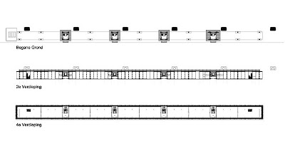
Plan and section drawings from OTH Architects
As is usual with areas of the city where artists dwell, word caught on and the businesses and restaurants started to set up shop. One of them, an advertising firm called Dawn BV, is leasing space in the Kraanspoor Building. It has to be one of the sexiest offices on the planet! The architects Ontwerpgroep Trude Hooykas BV propped a glass box on stilts over an existing mobile shipping crane rail superstructure. At 270 meters long and 12.6 meters wide, it’s appropriate that the building took on a train-like proportion. The building is like a super model for me - its looks are all that matter. But scratching the surface this building has much more behind that sexy body, it’s smart too. An all glass building needs some protection from the sun, so the building is surrounded by a dual façade of operable tinted glass sun shades on the exterior and wood louvers on the interior. It utilized the existing structure and crane access stairways. This solution uses existing industrial structure and infrastructure to provide prime office space. It supports the revitalization of a fringe city development and does it without leaving a footprint.

Ijburg - The 1996 brain child of urban planners Palmboom & Van den Bou, IJburg is a new district east of the docklands. It is the next wave of development for the city. Seven islands with 18,000 units are planned for some 45,000 residents. These are the gray and cream colored islands pointing to the upper right in the image above. The first three islands are nearing completion (the gray islands) with homes for 15,000 residents. Phase 2 - the cream colored islands - was rejected by the State Council for environmental reasons (can you even imagine the US EPA ever approving building a new island?) but was resubmitted in 2010 and is awaiting approval. Planning includes four of the artificial islands that will provide 9,000 units and be constructed in several stages.

THE RECIPE
Within each of these developments there is a pattern of elements. They each include a list of key ingredients:
1.       Development started on the foundations of an existing, now defunct industrial site. Once success of the area was proven, the city planned for (and built) additional man-made islands for expansion. From and environmental perspective, the act of constructing new islands to handle growth seems to me a slippery slope.
2.       Existing building reuse is not a pre-requisite but is common.
3.       Businesses, retail, hospitality and residential programs are included in each area.
4.       Tram and/or bus service connect each area to the city center. 
5.       There are clear pedestrian, bicycle and vehicle pathways connections to and within the development.
6.       Project areas are no more than ¼ mile from recreation areas.
7.       Planning incorporates civic or cultural institutions (i.e. schools, libraries, theaters, cinema.)
8.       All have abundant waterfront access.

ENERGY AND CLIMATE
The focus of the development discussion above is largely on design, revenue and growth accommodation. Each is also highly regulated in terms of its consumption and environmental impact Amsterdam and the Netherlands are leading the way with new technology and practice in areas of Energy production, CO2 emissions, waste management and public transportation. The Netherlands have signed on to the EU energy policy and Amsterdam has by 2025 targeted a reduction in CO2 emissions to 40% of 1990 levels. According to an EU European Commission report, they aim to make get there with multiple forms of renewable energy - wind, solar, hydro, bio fuels and bio waste.
A new waste to energy program is diverting trash from expensive landfill sites and is converting it to clean energy in the form of power and district heating. Public bins separate glass and cardboard for recycling but by and large the rest goes in the trash. Consumers do pay a deposit on glass, aluminum and plastic bottles to discourage tossing them but according to this blog and the energy producer AEB the metal is recycled after incineration. The buring cleans and purifies the metal making it more valuable on the market. At 32% efficiency the power plant is well below the most efficient coal fired plants and 1/3 of the peak performance of DONG Energy’s power/district heating plants in Denmark

Architectural credits are from the Archdaily Amsterdam City Guide